Red.
Level 12, 160 Queen Street Melbourne, VIC 3000, Australia
Founded in 2002 by two designers and a retail marketer, Red has grown significantly from the team of six that set up shop in a Melbourne terraced house. Firstly, they opened a studio in Vietnam and more recently they’ve entered a joint venture with NY based architectural practice DHD to form RxD, which will facilitate the servicing and rollout of projects for both the consultancies’ clients across all time zones.
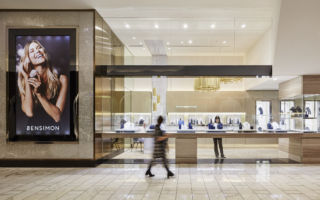
With a focus on retail and hospitality, the practice has worked with both local and international clients such as Uniqlo, Specsavers, Myer, Brickworks, Wine Republic, Tradies, Ted’s Cameras, Bensimon jewellers and Crown Casino.
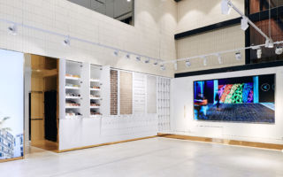
It was their client, Brickworks’ purchase of a US company that led Red to the partnership with DHD, as Brickworks expanded their presence in the US with the opening of a showroom on 5th Avenue. The first overseas showroom in Manhattan, was swiftly followed by openings in Iowa and Philadelphia. Located in consumer shopping districts, the sleek, spacious showrooms double up as events spaces and provide a one-stop-shop for both trade and public customers alike.
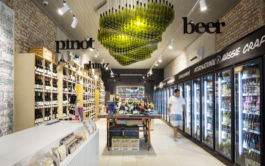
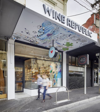
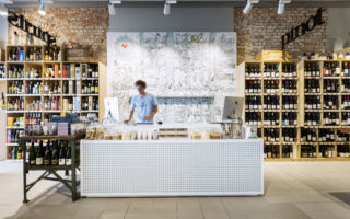
Our favourite projects have to be their localised concepts for Wine Republic. While the brand’s identity is so simple and functional, we love how Red bring the storefronts to life with hand drawn graphics by local artist Brian Cheung; in one instance they’ve created stand out by making clever use of the shopping strip’s canopy, flowing the illustration, providing a visual draw into the store. Inside there’s a lovely urban rawness created by the use of bare brickwork and upcycled furnishings, they’ve also included stand-out features like the eye-catching lighting feature by designer Volker Haug. However, the pièce de résistance has to be floating signage, providing immediate, yet beautifully simple navigation.
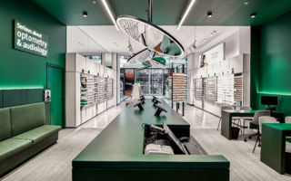
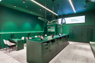
Working with UK optical brand Specsavers, Red was selected to design a concept specifically for the Australian market. Their design sees them creating two distinct zones within the space, using a change in colour to create the delineation. The front of store space is perfectly lit for frame selection, while the rich emerald-green space at the back of the store slows the pace, creating a cosy, cocooned consultation space. Interestingly the colour evokes as sense of clinical authority and reassurance, without actually feeling clinical at all!
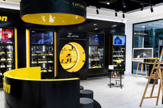
Their work for Ted’s Cameras takes a similar approach, each brand is given its own dedicated space, these are largely monochrome, except for Nikon’s area which includes pops of their brand yellow, and circlular, lens-like details creating a great highlight to showcase one of their ranges. The inclusion of the gallery and café spaces, which can also be used for courses and talks, creates an inspiring and creative hub for the brand, one that will no doubt help the Ted’s brand foster a greater sense of loyalty amongst its customers.
There’s a great freshness to Red’s projects and their designs embody a real confidence, with lovely details that make you look twice.
We look forward to seeing more.
For further information, speak to Founding Chairman, Roy Tavenor, who is based in their Melbourne design office.

