CADA Design
Suite 4, 9 Bell Yard Mews London SE1 3UY
CADA is an agency that we have admired for years. Expert in both graphic and interior design, they have established a real niche in food and hospitality, with a host of world class projects under their belt.
Based in London, they have an international portfolio, with completed projects in North and South America, Europe, the Middle East and Asia (especially in Seoul), which has gained them a worldwide reputation alongside critical acclaim.
Their strikingly diverse range of works showcases their collective skills, which include retail and hospitality interiors, corporate identity and brand strategy, graphic design, digital design and packaging.
Their work for the new concept restaurant Bunnychow is a brilliant example of re-branding, taking a street food operator and transforming it into a permanent brand, with a witty graphic tone of voice and sophisticated branding.
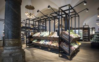
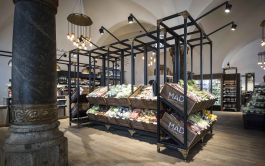
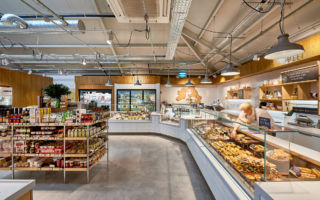
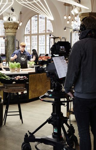
We spotted one of CADA’s projects in Copenhagen with the wonderful MAD Cooperativet, a glamorous foodhall from Coop in the regenerating Central Station. It’s without a doubt the best supermarket in Denmark!
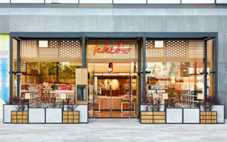
We love the Peacock Kitchen; a glamorous street food court at Emart in Seoul, complete with quirky food trucks.
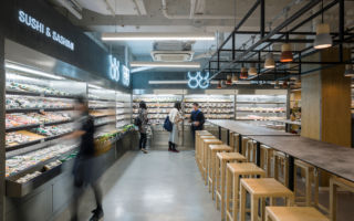
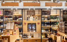
The interior and identity for The Japan Centre in London, features a materials palette and graphic language that complement each other perfectly to create a sense of calm professionalism.
More recent projects continuing to show their prowess in food retailing and hospitality whatever the brand, and wherever it is in the world.
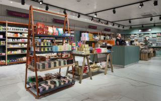
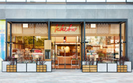
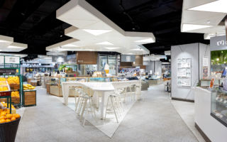
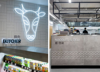
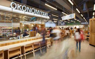
Ichiba brings the best artisanal food, drink, homewares and gifts from Japan to Westfield, London. Designed as a ‘community hub’ to celebrate Japanese culture, the food hall combines a mix of in-hall dining with a number of different food stations and a supermarket. The open kitchens draw visitors into the experience, allowing a deeper dive into the culture and cuisine, encouraging visitors to visit the supermarket cook at home.
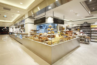
In Jarrolds premium food hall in Norwich, the beautiful copper piping signage, combined with the muted greys and soft green tones bring a earthy warmth to the space. Once again hospitality is as the centre of the concept, drawing in customers and encouraging dwell time. With contrasting materiality and a very different vibe is their contemporary concept for Lotte in Seoul, which has the feel of a designer homewares store.
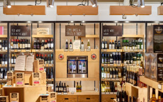
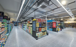
CADA was responsible for the design of the Aldi Local concept, which brings the brand into busy city centres with a smaller footprint. The new concept focuses on conveying the brand’s core messaging of freshness, provenance and value. Navigational signposting is really clear, and the editorial tone creates warm and friendly atmosphere for the new store format.
Consummate professionals, CADA also run a separate pop-up food business, giving them the operational expertise and commercial savvy to underpin their design skills.
