Chute Gerdeman
455 South Ludlow Street, Columbus, OH 43215 USA
Chute Gerdeman are one of the big boys of retail design in the USA.
Elle Chute and Denny Gerdeman, studied industrial/environmental design and architecture respectively, and brought their complementary skills together to form Chute Gerdeman in 1989.
Over the years, they’ve worked across industries from hospitality to grocery and within retail across almost every sector; with clients ranging from Whole Foods Market, Dominos and Hamleys to Verizon, Lexus, Revlon and Mars, with M&M World probably being one of their most memorable concepts in recent years. For many of these clients, they’ve become and trusted partner, with many longstanding relationships.
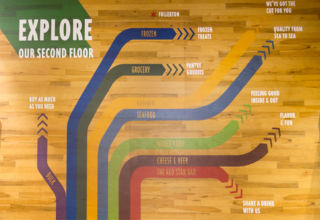
A place based approach is central to their concept for the stores that they’ve designed for Wholefoods. Their branding team created distinctly different identities for each store, which along with the interior concept, capture the cultural essence of each site. Cleverly, the interior furniture is similarly constructed, but the aesthetic can be changed for each site.
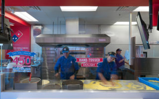
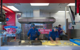
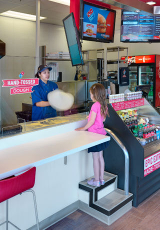
Changing the layout, was one of the key factors in improving Domino’s connection with its customers. Rather than facing the entrance, the counter now runs the length of the store, and the cash desk has been relocated to the far end of the space. Now the first thing that customers see is what Domino’s does best – make pizza, the theatre of the brand is no longer hidden away.
Working with C&A in Brazil they created a concept, which moves away from a sea of product and puts greater emphasis on showcasing collections to hero each department. New mannequin displays and specially designed furniture create opportunities for more interesting VM, along with a change in lighting for each area, which helps define the departments with much greater clarity.
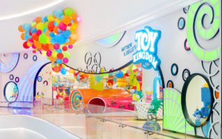
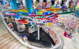
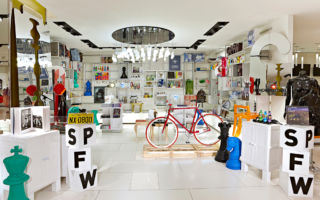
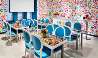
We feel like we’re entering the world of Willy Wonka with their over the top stores for Dylan’s Candy Bar (New York and Chicago) and Toy Kingdom (South Korea). Both concepts feature larger than life characters, an abundance of colour and a sense of escapism – immersing children and the inner child in their adult customers.
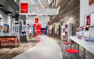
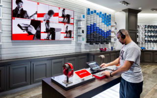
In a different way, themed spaces also play their part in Chute Gerdeman’s concept for telecoms giant Verizon. Customers are led on a pathway through the store which takes them through different zones dedicated to sports and fitness, music, gaming, home monitoring and energy management, providing access to devices, apps and accessories which connect consumers to their lifestyle needs. It may be a couple of years old now, but it’s still a refreshing approach to a telecom store, in a market, where in most cases, the product is far more innovative that the space in which it is sold.
Chute Gerdeman is successful in producing extremely solid and creative design, which stretches their client’s brand and delivers commercially.

