Creneau
Hellebeemden 13 3500 Hasselt Belgium
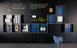
Leading Belgian design consultancy Creneau have been around since 1989, designing interiors, identities and packaging. Early on they gained recognition for creating some really interesting pop-ups, events and exhibition spaces for a number of denim brands including Levi’s, Wrangler and Lee.
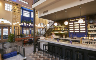
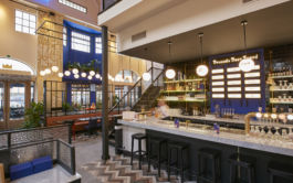
Today their spread is much broader and whilst they still work with a number of retailers, much of their work is focused on the design of interiors for the hospitality sector, working with restaurants, bars and hotel chains, and in addition to their HQ in Belgium they now have a second studio in Dubai.
In the age of digital banking, physical branches have seen a lot of change. Creneau’s concept for ING takes retail banking to another level, putting emphasis on personal contact and advice. Customers may question whether they’re in a coffee bar or a bank, regardless, it looks like a bank you’d actually enjoy visiting. Similarly, their concept for Van Hart looks like no other hospital shop/café that you will have ever visited before, the warm tones of the natural materials create a relaxed feel, a welcome respite from the more clinical wards.
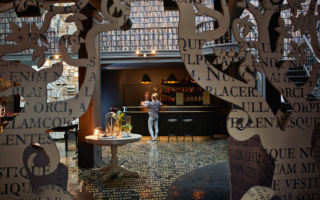
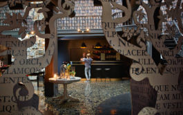
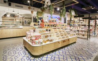
Creneau’s pop-up for the Tomorrowland Boutique is inspired by the music festival bearing the same name. The dreamlike space, with nuances of Alice in Wonderland, allows customers to explore Tomorrowland through displays of merchandise and a history room with videos, soundtracks and even a bar, providing total immersion in the festival brand.
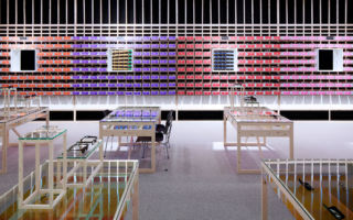
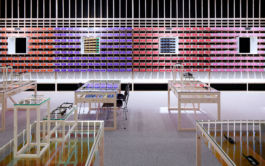
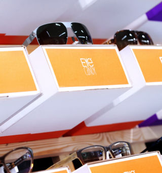
Another of their distinctive concepts was their design for the optical store Eye Candy. The colour banded concept creates a point of difference, in a market where we are used to seeing white walls awash with backlit product. The shelf on which each product sits, becomes the packaging for the eyewear, with secondary compartments containing giveaways, so customers take away a part of the store with each purchase.
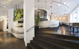
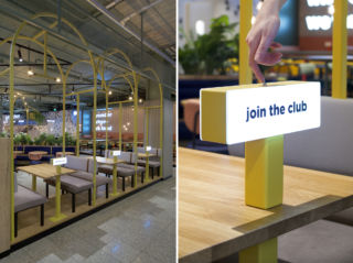
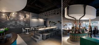
Creneau has designed numerous hospitality concepts from airport food areas (The Cloud Club) to bars and fine dining (lots of them!). We love their concept for Tero – the design for the plant-based restaurant features materials, textures and features that beautifully reflect the earth, landscape and even the solar system.
It’s hard to articulate what’s specifically different about their approach, but their designs are always thoughtful and engaging, often with a level of playfulness, that’s set just right for the brand.

