Jennings Design Studio
3 Talbot Street, North City, Dublin 1, Ireland
With over 20 years’ experience, including five years working with renowned architect Nicholas Grimshaw, Brian Jennings founded Jennings Design Studio in Dublin.
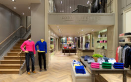
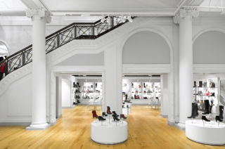
With this heritage, their retail and hospitality interiors concepts show empathy for the architecture of the buildings in which they are situated, whether they are contemporary or historic, such as their work for Dublin’s much-loved department store Clerys.
Following a damaging flood, Jennings Design Studio was invited to undertake a complete refurbishment of the department store. The interior pays due respect to the historic detailing, retaining the ornate plasterwork and beautiful balustrades, whilst contemporising all departments with new furniture and a light colour palette throughout.
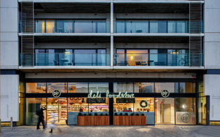
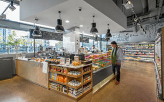
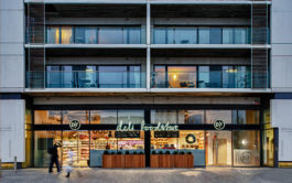
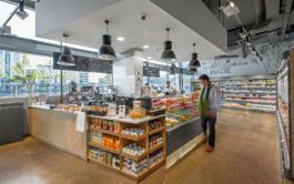
In their concept for Donnybrook Fair (DF), the steely grey colour palette mixed with natural materials and clean graphics, give the upmarket deli a quality and trustworthy feel. Great lighting really enhances the presentation of their home-made food ranges. The result is a contemporary concept which is a perfect fit for Dublin’s rejuvenated and bustling dockland location.
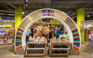
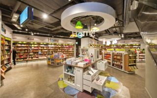
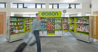
The chatty tone of voice and colour coded graphics make store navigation simple for customers visiting Eason bookshop. Whether customers are shopping for books or stationery, the informative graphics also give prompting cues that subtly make the search for what you want that little bit easier. They’ve also designed a natty pop-up for the brand, with specially designed flight-cases, which are not only functional, but provide a secure lock-up for Eason’s mobile retail offer.
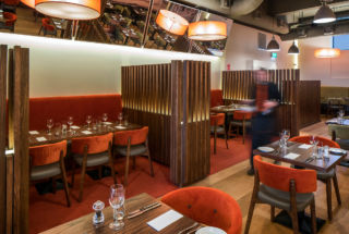
For their second restaurant for McHugh’s in Dublin they’ve created a flexible space, using lighting, colours and material textures to create a warm ambience. We like the use of slanted mirrors for customers to be able to see what’s going on around them, acknowledging that part of the fun of eating out is seeing what everyone else is up to!
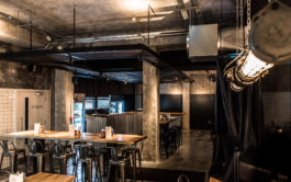
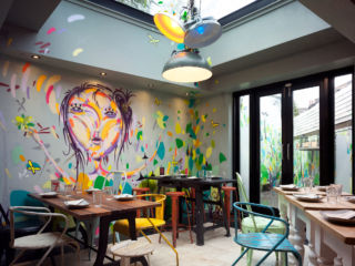
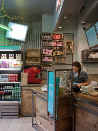
Much less formal is Tootoomoo, the haphazard nature of their design, with its use of reclaimed materials and eclectic furniture, give the restaurant and shop a genuine Asian street food vibe. There’s a great use of natural light in the restaurant area, with a huge skylight, allowing some of the outdoors, in.
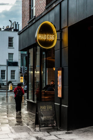
Mad Egg’s ‘Get Laid – Get Fed’ cheeky graphic language, gets the brand noticed. Inside, Customers can watch on as food is prepped in the open kitchen and the flexible layout and lighting allow the space to morph to suit diners for breakfast, lunch and dinner, accommodating different groups sizes and busy take away times.
Much of their work is undertaken in Ireland but they have also completed many projects in Europe, Asia and America. Speak to Brian Jennings for more details.
