Prism Design
Bldg_D, 1st floor_No.101, Garden Office, No.161_Lane, 465_Zhengning Rd, Changning District, Shanghai, China
Set up in Shanghai in 2009 by Japanese born, Tomohiro Katsuki, Prism design specialises in hospitality and retail design working predominantly with brands in China, undertaking a few of their more recent projects in Japan, since opening studios in Tokyo in Hiroshima Fukuyama.
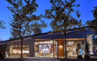
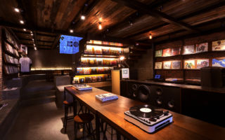
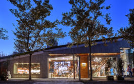
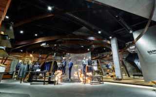
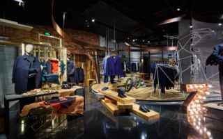
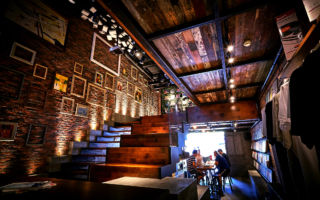
They’ve created a number of store concepts for ‘Both’ – a shoe brand that was borne out of a Japanese rubber company making high-end sneakers. The stores fuse footwear, fashion, lifestyle music and social spaces in varying proportions, creating cool arty spaces for their customers to hang out in.
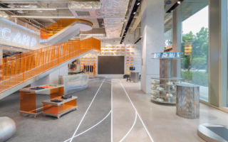
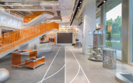
Recently opened is their concept for Runner Camp is a 2-storey flagship in Shanghai. An urban athletics centre where shop meets gym. The simple orange and pale monochrome colour palette works really well, giving the space a light and airy feel and enhancing the range of textures in the concept’s materials palette, which has a predominant industrial feel in line with the ‘urban’ theme. While the ground floor is given over the shopping experience, including a consultation area featuring a track for runner’s gait analysis, the first floor provides space for the Runner Camp gym.
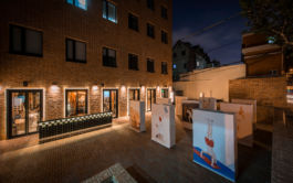
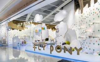
Their design for kids’ shoe brand Fly Pony is so simple in terms of concept and materials, yet beautifully thought through. The concept reimagines the world of the brand’s child character ‘Tim’ who ventures into a magical, dreamlike world. The simple white cut-outs let children colour in with their own imaginations, or literally as they are allowed to draw on the surfaces. The Shanghai backdrop used here could easily be changed for another city or vista. We love the coloured dots; some of which are magnetic, so can be arranged at whim, whilst others can be removed, leaving space to insert shelving or additional VM.
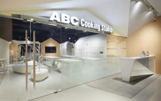
Similar in nature, in terms of simplicity and colour is a concept that they designed for ABC Cooking Studio. With 140 studios, many of which are in shopping centres, it’s an interesting concept in terms of ‘retail’ too, which combines a contemporary design with the ancient cultural love of cooking.
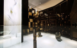
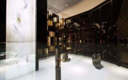
A little darker in colour palette is the interior design for Japanese restaurant Suigetsu, which fuses Japanese food with the culture of the Chinese area of Chongqing in which it is located. With a glowing light, Japanese Zen garden at its core, the surrounding rooms are calm and if not a little sombre, layered with wooden and fabric screens, fabrics and a highly polished ‘lacquer’ floor. Light is cleverly and subtly reflected into the space via angled pale wooden louvres, placed in the framework that partitions the space.
We look forward to hearing more from Tomohiro Katsuki and seeing the projects that come out of his Chinese and Japanese studios.
Photo Credits: Runner Camp – Alessandro Wang. Mr Both & Fly Pony – Katsumi Hirabayash.
