Loblaws at Maple Leaf Gardens, Toronto
Design Credit:
Landini Associates, Sydney
landiniassociates.com
The supermarket sector has been somewhat static over the past couple of years, with little of the ground breaking innovation we saw at the beginning of the Noughties.
Certainly in the UK, the big supermarkets seem to be permanently stuck in a price war and a battle over convenience, with precious little interest in improving the instore experience.
So it is very refreshing to see that Loblaws has reinjected passion into supermarket design with what we think is the world’s best looking and most vibrant supermarket concept.
Conceived by Sydney based design genius Mark Landini and his team, Loblaws at Maple Leaf Gardens is a truly sophisticated ‘anti big’ creation.
The 85,000 sq ft store is located in the iconic old Maple Leaf Gardens Building, previously home to the ice hockey stadium, and the design pays homage to the history of the building in the most charming ways.
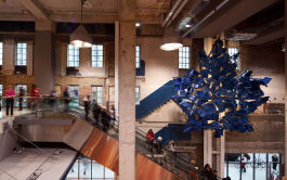
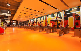
A sculpture in the shape of a giant maple leaf constructed from reclaimed blue stadium chairs, ice-rink light fixtures from the building, restored windows, exposed original concrete walls, wall murals and other artistic images are just a few connections to the past found in the store.
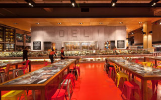
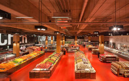
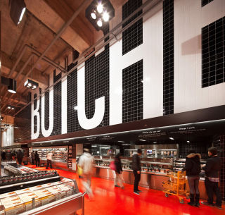
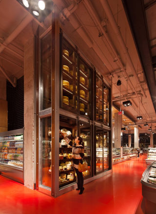
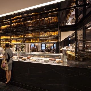
These historic elements are combined with slick contemporary finishes; stainless steel and blonde wood surfaces, glossy black tiles and a super striking red and orange floor inspired by the colours from the original Loblaws logo.
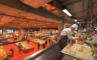
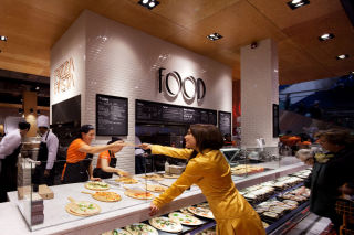
Perhaps more important than the design is the focus on food theatre.
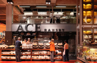
There’s a specialist Tea Emporium, a full size artisan Ace Bakery and 14 instore chefs produce the best of East and Western cuisine, with a wood fired pizza oven and sushi kitchen.
There’s an amazing 18ft wall of cheese and tons of eating points. There’s even a cookery school.
Simply, mouthwateringly awesome.

