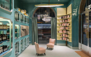


Aesop, Milan
Design Credit:
Dimore Studio, Milan
dimorestudio.eu
Australian cosmetics brand Aesop’s over-riding philosophy has always been that every store should be unique; a stylish and creative interpretation of both the brand’s artistic values and the location itself.
This is why Aesop stores are always located in the very best and most interesting shopping streets. We certainly use them as a marker for where’s cool whenever we visit a new city!
Their new store in Milan delivers on this promise beautifully.
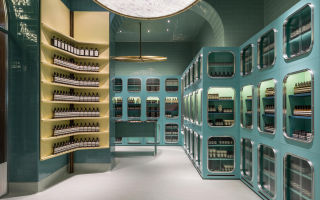
The Melbourne based company, in tandem with Dimore Studio, has brought villa pantry chic – with a neighbourhood bottega twist – to a corner of Milan’s historic cobblestone-paved Corso Magenta.
Milan-based Dimore Studio continues its love of the historic and reclaimed with its new Aesop design.
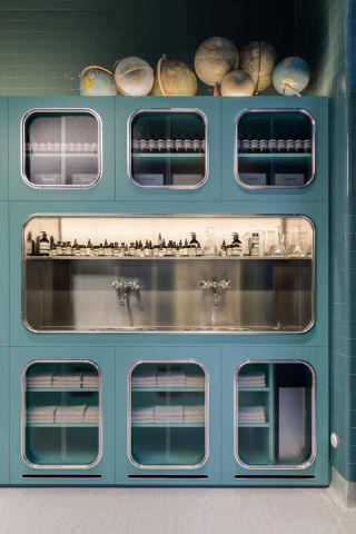
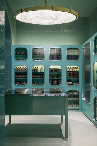
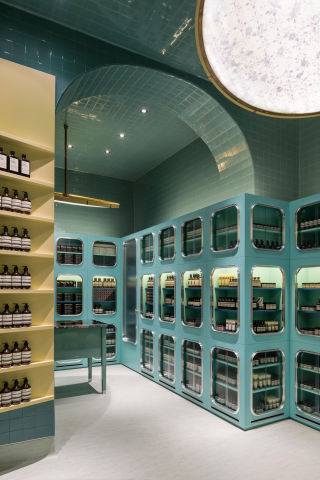
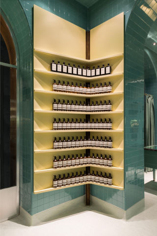
Wrapped with chrome-encircled, interior-lit display cases reminiscent of the early twentieth century and adorned with oversized brass-rimmed disc lights, the store’s aesthetic has a retro tinge that recalls butlers’ pantries of old – with a worldly touch.
It’s almost like a Wes Anderson film set.
Gleaming teal tiles adorn the powdery lemon-and-green space, lending a touch of old-school underground metro glory, while a stainless steel feature sink and a polished central table provide a setting to test and explore products.
The combination suggests a kitchen preparation area, enticing customers to test and trial the products on offer.
Grey linoleum provides a soft note that’s further softened by two plush mid-century inspired chairs.
Globes of the world gather in an upper corner, capitalising on the store’s jaunty, well-travelled vibe, and Aesop’s understatedly packaged products march in crisp, tidy rows throughout the store, bringing an apothecary note to the premises.
The main essence that runs through every store is water. Staff are trained to wash hands as they tell the story of the brand.
The moral of this fable?
Aesop’s slow and gentle global expansion over the past decade illustrates how great retail needs to be tactile, creative and true to their own internal philosophy.
Aesop never disappoints, making it very our very favourite ‘dog whistle brand’ (a reference for those in the know)