Missguided Bluewater, Kent
Location:
Bluewater Shopping Centre, 18 Bluewater Pkwy, Dartford, Greenhithe DA9 9ST, UK
Design Credit:
Dalziel & Pow
dalziel-pow.com
Online clothing phenomenon Missguided is expanding its clicks-to-bricks empire with a second store in Bluewater. The latest offering expands on its ‘On Air’ concept store debut, with a high-energy design made for social media sharing and participation.
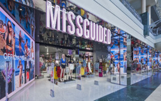
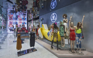
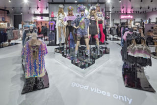
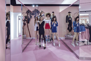
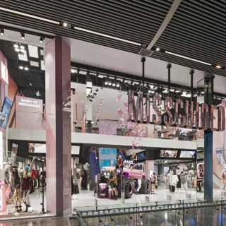
Dalziel & Pow have adapted the inaugural store’s design to suit the new space’s more intimate, single-storey setting. An artfully symmetrical open store front agleam with neon signage and mirrored columns draws in visitors. Just beyond the entrance is a large-scale playful banana installation surrounded by colourfully dressed mannequins.
Dalziel & Pow delivers a high-energy, immersive experience for click-to-bricks fashion icon Missguided.
Ever-evolving campaign media and user-submitted digital content is displayed on massive floor-to-ceiling digital screens throughout. These are captured by a mirrored ceiling, creating a ‘house of mirrors’ fairground effect. This is continued in the Miami-themed fitting room area, with the mirrors used to suggest an infinity pool setting.
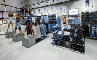
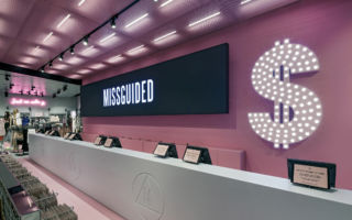
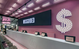
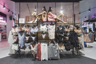
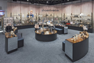
Product is divided across themed, changeable ‘sets’ that have a blingy, retro nightclub vibe. A ‘Shoeniverse’ features spangled wall drapings and reflective surfaces. A denim area gets a stonewashed, blue-tinged makeover. A clubwear section features quotable neon signage and cheeky floor projections, while the register area glows with an enormous dollar sign.
Flexible fixtures and digital signage allow the space to evolve with new collections or events. Contrasting materials, clever lighting and talking point moments provide photographic moments for visitors – encouraging engagement and organic, branded experience sharing.
