Etude House, Seoul
Design Credit:
Dalziel & Pow
dalziel-pow.com
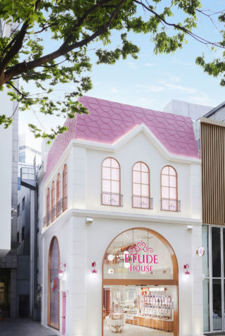
South Korean cosmetics label Etude House has redesigned its Myeong-dong flagship to reflect its new brand positioning. An interactive beauty destination dubbed the ‘house of colour play’, the store encourages customers to get creative with cosmetics.
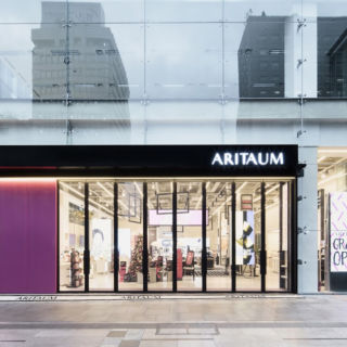
Spanning three storeys, the newly updated space features a revamped façade, digital experiences and a brand identity in keeping with Etude House’s ‘sweet dream’ philosophy.
Personalisation and experimentation are at the heart of Dalziel & Pow’s transformation of Etude House.
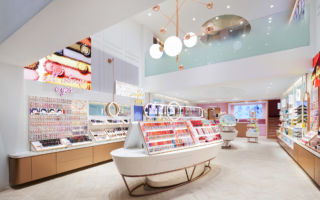
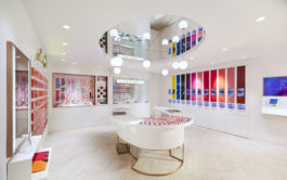
The new look references the brand’s iconic pink tones and elaborate textures, but with a more contemporary vibe. The bright pink roof has been retained and is now accompanied by a selfie-friendly pink side door, but the remainder of the store uses a softer, fresher palette and more modern finishes.
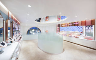
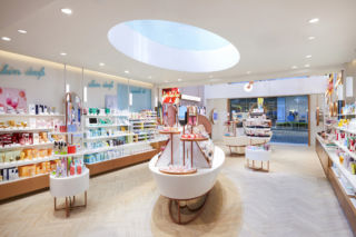
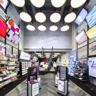
On the ground floor, customers socialise around a central mid-floor table illuminated by an overhead lighting feature. Wall mirrors encourage browsing and testing, while a frosted glass rail provides a glimpse of the mezzanine level.
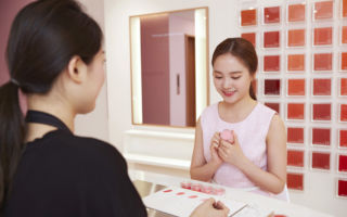
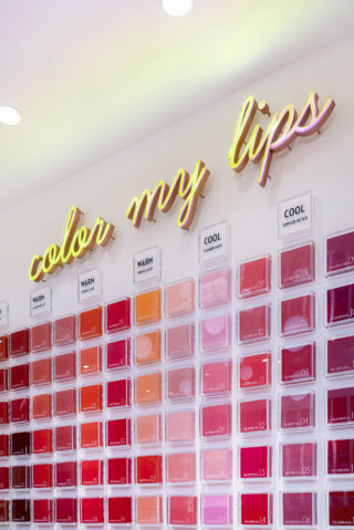
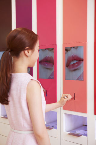
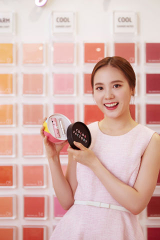
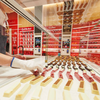
Upstairs, customers can explore their ideal cosmetics shades and watch digital makeup and skincare demos. Beauty experts provide tips on this season’s trends, while digital services help customers with tasks such as finding their exact skin shade. The second floor delivers further play and personalisation, letting customers blend and package their own custom lipsticks.
Upbeat wayfinding, tips and tricks, and social sharing encourage engagement, while a Loyalty and Gifts program rewards loyal customers. Confident and sophisticated, the flagship marks the next evolution in a brand that knows how to adaptively target the early 20s cohort.

