BFresh, Boston
Design Credit:
BLINK, Stockholm
Blink.se
Whoever thought that a supermarket could be the next big hipster hangout?
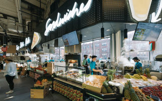
With its indie styling, keep-it-simple culinary ethos and dual produce and takeaway offerings, bfresh has the potential to do for supermarkets what Mad Men did for Scandinavian interior design.
A new concept from Ahold, bfresh provides a supermarket retail experience that melds edge-pushing urban shopping trends with nostalgia for the produce halls and family-owned corner stores of old.
Scandinavian retail design agency BLINK has gathered all the ingredients needed for a fresh take on the urban food hall.
It’s a traditional market with a 21st-century upgrade – and a focus on the gourmand.
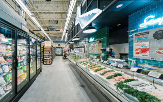
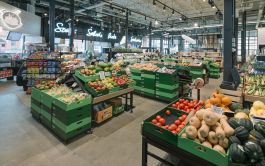
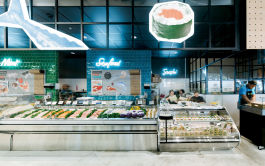
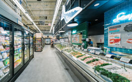
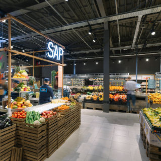
A proponent of fresh, from-scratch cooking and eating, bfresh forefronts colourful displays of produce and pre-cut deli-style offerings – everything needed for a hearty, home-cooked meal can be gathered all in one place.
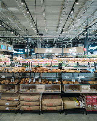
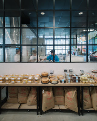
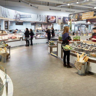
Curated selections of imported and specialty items, along with an open-concept artisanal bakery speak to a gastronomically minded urban crowd.
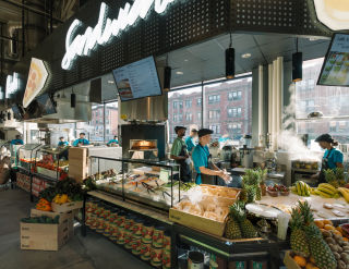
Seasonal and prepared in-house using as few ingredients as possible, a menu of takeaway options from the ‘Little Kitchen’ section area of the store draws in workers on their lunch breaks or heading home – a first-in-market approach inspired by a successful model trialled in the Netherlands.
Meanwhile, cheerful proclamations underscoring the shop’s emphasis on local and organic produce, along with the produce used as decorative accents throughout score points with localvores and the health- and environmentally conscious.
Oversized hand-drawn posters and moveable graphics along with retro-inspired cursive neon signage are used to create a relaxed, casual vibe, while simple design motifs such as patterned produce pallets lend visual interest without overpowering the star of the show: the food.


